Branding, Design
The Acton Town Council
Design
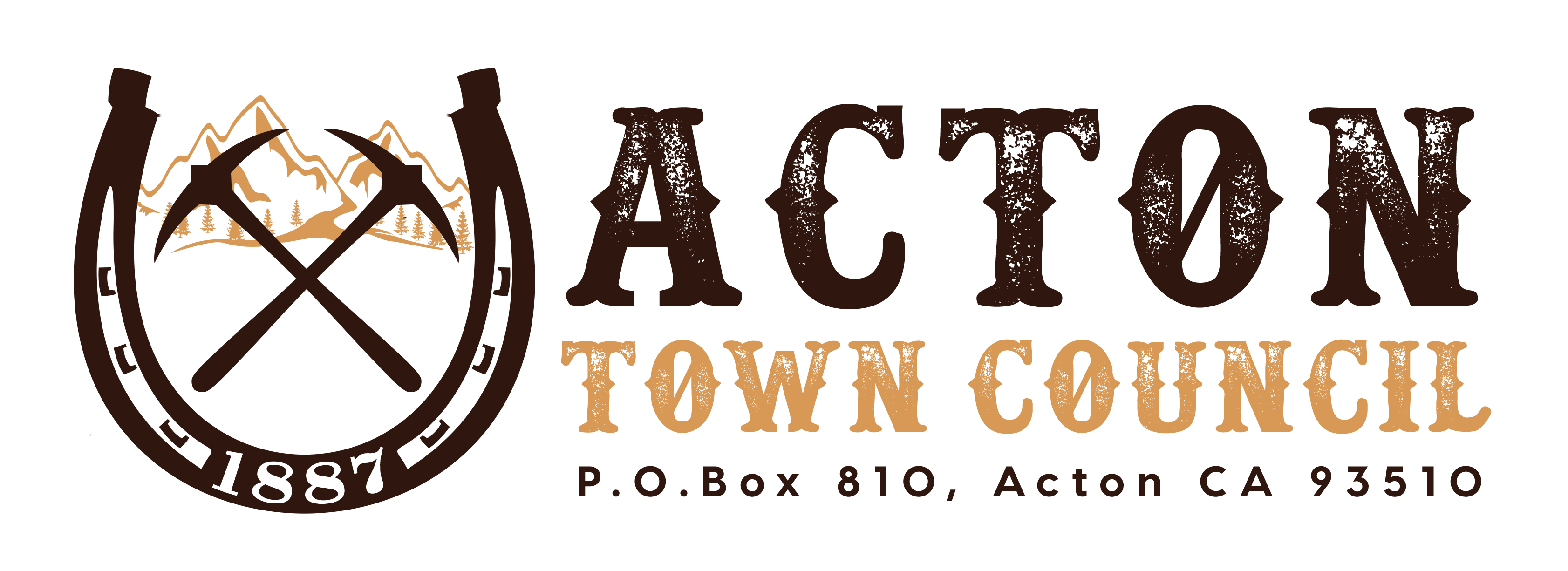
A rugged logo to pay homage to a unique community
The Acton Town Council approached me to create a fresh new brand for their organization to connect with the roots of their community.
Formally a rough and tumble mining boom town, Acton California is an uniquely untouched diamond in the rough. Boasting a rural “cowboy up” vibe, this small sleepy community is proud of its beginnings.
- Client: Acton Town Council
- Services: Brand and Logo Development
Ruth B - The Acton Town Council
I found Lindze at Pave Eleven through a referral by a colleague. As a member of our local Acton Town Council, I was tasked with finding someone who could help us to create a more professional image for our council, not only in our interactions with our community members and constituents but with our Los Angeles County agencies as well.
Lindze took the time to really listen to what we wanted our logo to represent. Our unique rural town has a rich historical past with deep roots in gold mining beginning back in 1887. But our modern day profile is more that of an equestrian community whose residents still embrace our mining history and are willing to fight to preserve our rural lifestyle. Our logo needed to speak to all of the above.
Lindze was not only able to deliver quickly on our requests but gave us multiple choices from which to choose. Her designs could not have been more on point with what we were hoping to achieve. She delivered a badge style logo and a letterhead logo and in many different file formats so as to fit all of our immediate and future needs.
Working with Lindze at Pave Eleven was a pleasure. The entire Acton Town Council was blown away by the logo design and we could not be more pleased. She nailed it!

